Q2. HOW EFFECTIVE IS THE COMBINATION OF YOUR MAIN PRODUCT AND ANCILLARY TEXT?
Mise En Scene
In the pre production process, our group created an idea of how we could manage to reflect social realism, therefore we decided to implement certain settings and locations in the film in order to create mise en scene that identified with social realism. We created Moodboards that consisted of drugs & alcohol and later implemented it throughout key moments in the film.

|

|
|
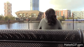
The mise-en-scene within the film was chosen specifically to showcase the genre of the film. In the film the protagonist is always is seen in a number of locations in which people may say are working class or run down environments. For these set locations we filmed in south east London, using specific sites that reflect social realism such as a bench by a shopping center and train stations such as new cross and surrey quays.
|
|
Props/costume
|
The props within the film reflect the genre of social realism because they showcase a life of mental illness and drug addiction, which is very common in many contemporary social realism films. In order to connect with the genre of social realism, we used alcohol, an artificial bag of cocaine, and a pharmacy to showcase a large drug selection.

|

This connects directly to the ancillary task because in the teaser for the film, the main character is seen with her hair over her face, giving off a feeling of gloominess and depression.
|
|
A connotation can be drawn from the poster, which suggests that she is under the influence of drugs and as a result is able to give off a dull, unhappy feeling.
|

|
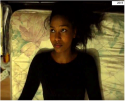
One side of the protagonist in the film reflects social realism through her decision-making. There is a specific scene within the film in which the protagonist laying on a run down bed with a dissatisfied look on her face. A still was chosen from this scene and used for the main image of the film review. This was chosen for the film review to assist the text in presenting a feeling for the viewer in which he/she could gain a better understanding of the true aim of the film.

Iconography
Iconography in the film is done through the use of props such as drugs and alcohol. These props are revisited multiple times throughout the film in order to symbolize a reaction to mental illness.
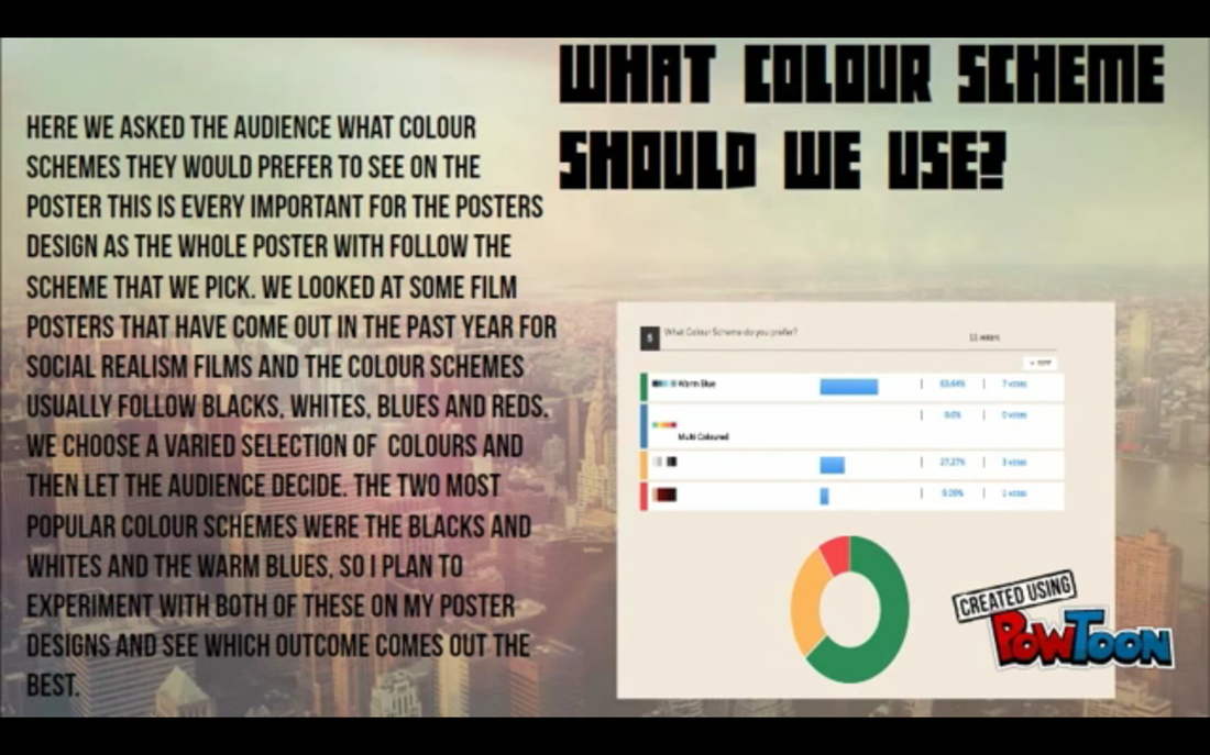
Colour scheme
The colour scheme in the film was chosen through the analyzing of results gained from a film questionnaire given to 10+ participants. The colour scheme chosen for the film was a warm blue and correlated well with the actual filming process because the protagonists opposite life was made to seem very warm and welcoming.
Font
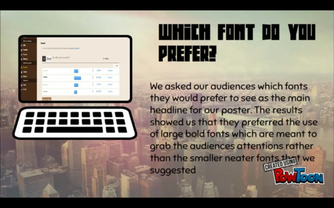
The font used in the main poster and teaser, were both heavily considered after taking in suggestions through a questionnaire, however it was inevitably decided on to go with fonts that were not suggested.
Choice of Review Context
We pitched our film review to an audience that is either trying to expand their taste in film or is already fascinated with short films that push the boundaries of social realism. Our film review will be presented on an online film review website. The film review is very straightforward and correlates with the genre of social realism therefore film enthusiasts could identify with the film easier. There will also be a great understanding of terminology by a younger audience because they may be able to identify with the protagonist within the film who is a young woman.

Main Characters
The main character was presented in a very dark manner and due to the choice of lighting, special effect on editing and character positioning. This is done in an attempt to help the general audience immediately identify the genre of the short film.
|
The main character is shown in the film review with a very sad, melancholy look on her face. This is also done to reflect social realism and give the audience and idea of what the film would be about through the film review.
|
|
Overall the main character represents a niche social group of woman in the world who are dealing with mental illness & depression.
Question 2: answered in an interview format
Interviewer: Tashika Bailey
Interviewee: Nathan Higgins, Ryan Spencer
Interviewee: Nathan Higgins, Ryan Spencer
