A Flatplan shows where all articles and adverts are laid out, and in what order. It allows complete control of the publication production process avoiding confusion. Without a flatplan, the production director and advertisement director struggle to control the content shown on the poster for a film.
Audience: Questionnaire Analysis
This questionnaire analysis for our poster was made by NATHAN HIGGINS. He looked at the feedback given after the survey was distributed to our target audience which are aged between 15-25 years old. Approximately about 10 questionnaires were returned for NATHAN to analyze. From the results he briefly typed up what the audience did and did not want in a short film poster. This helped us when we made our short film poster as we would know what we would add according to the audience feedback as we wanted to make a poster that the audience would want to see and attract them to watch our short film.
Poster
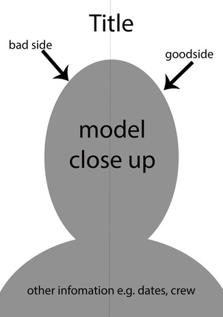
Before the production of the final poster, a few flat plans had to be developed in order to brainstorm ideas and transfer the knowledge onto the final poster. The main features that were important on the majority of the posters we looked at was the headline, main image, text and star ratings. So before NATHAN HIGGINS started making digital posters we made a paper flat plan which we thought of as a group we put ideas on paper so that it was would be easier for NATHAN when he produced it in digital form.
Flat Plan 1
|
HEADLINE: Placed in the top of the page in the centre in bold letters 'DOPPELGANGER'.
MAIN IMAGE: The main image is one image in the center of the poster (GENREIC) TEXT: The text is placed at the bottom of the page with is going to consist of details such as the directors, producers, actors and actresses. RELEASE DATE: Placed above the text on the right side in bold. |

|
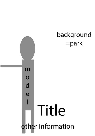
Flat Plan 2
|
FLAT PLAN #3HEADLINE: Placed in the top of the page in the centre in bold letters 'DOPPELGANGER'.
MAIN IMAGE: The main image consists of two images cut in half and put together as one. TEXT: The text is placed at the bottom of the page with is going to consist of details such as the directors, producers, actors and actresses. RELEASE DATE: Placed above the text on the right side in bold. |

|
Digital Flat Plan: 1 |
Digital Flat Plan: 2 |
|
|
'Teaser'
A teaser trailer for an upcoming film, television program, video game or similar, is usually released long in advance of the product, so as to "tease" the audience. The teaser's were created by our team graphic designer 'Nathan Higgins'.
Teaser: 1
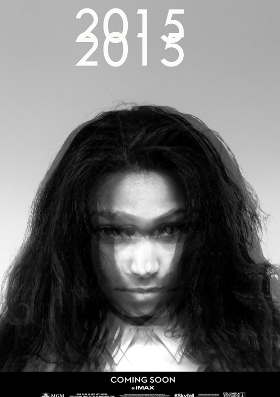
The flat plan 1 was used as a reference/blue print for how the final film poster would look. Nathan (Team Graphic Designer) took initiative and developed the flat plan into a final piece while adding a little creativity to the image. The image contains a black and white or chromatic, dimmed effect while also being blurry and distorted. These effects were added to this image in particular because it gives the audience an unusual feeling which confuses their perspective on how the film would be. While doing this it also allows the audience to make inferences in regards to the mental state of the protagonist, evidently giving off the idea of mental illness and social realism. After the effects were added, a headline of 2015 and a small sub-headline of coming soon was then placed on to the teaser in traditional fashion.
Teaser: 2

The second Doppelganger teaser was modeled after the second flat plan which consists of a character with a full body shot. We wanted to implement various different angles into our poster's because we wanted to use multiple avenues in hope of attracting the audience. The main text used for the film title also correlates directly with the theme/effects of the film poster because the letters are each replicated in black directly under the title. This adds a gloomy or mysterious effect to the poster, which relates directly to the genre of social realism or theme of mental illness.
Final Poster Editing Process
Hover over the image for an in-depth analysis


Final Film Poster

For the final poster, we decided to combine the monochromatic & blurred effect which directly reflects the bad life, with a saturated effect for the protagonists ideal life. We also faded the words on the left side of the film poster and left the other side simple in order to create a contrast between the two sides. lastly, we added a rating at the top with a quote from a source underneath to fit the norms of contemporary film portrayal.
